Introducing a new way to share your impact!

Hi everyone.
Today we’re excited to announce a new way to share the environmental benefits of your group’s repairs!

We’ve launched two new features:

1. New equivalencies :bar_chart:

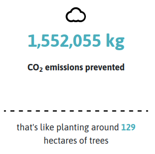
Previously, we used negative comparisons to help people understand the amount of greenhouse gas emissions (CO2e) saved by repairs, for example: we’ve saved x kg of CO2e, the equivalent of driving y km.

But we’ve now switched to a positive comparison, i.e. an activity that reduce emissions: growing trees. I posted about this idea in more detail last year here: How can we help you communicate your climate impact?

Now, all groups’ pages and all past events now use tree planting comparisons to help people understand how much CO2e has been saved.

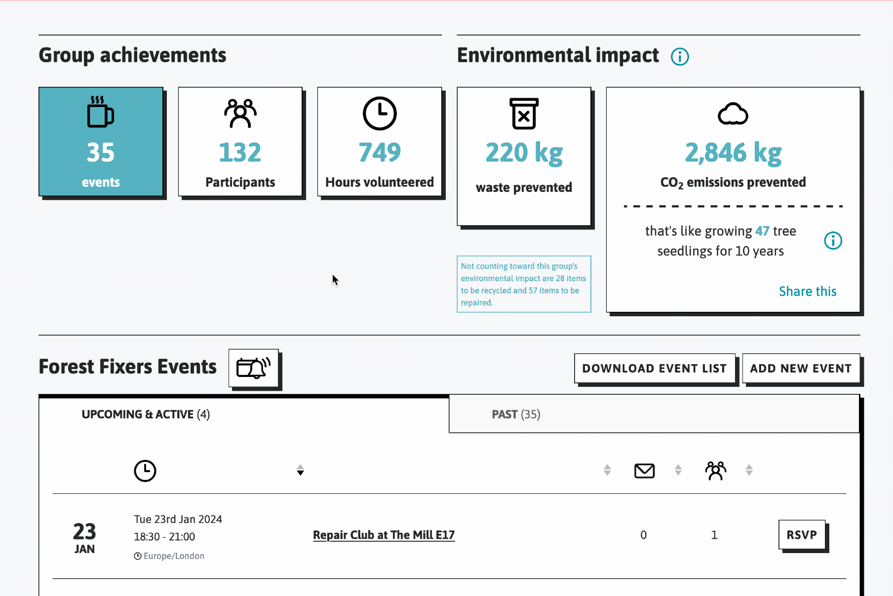
Here’s an example (number 1 in this screenshot):

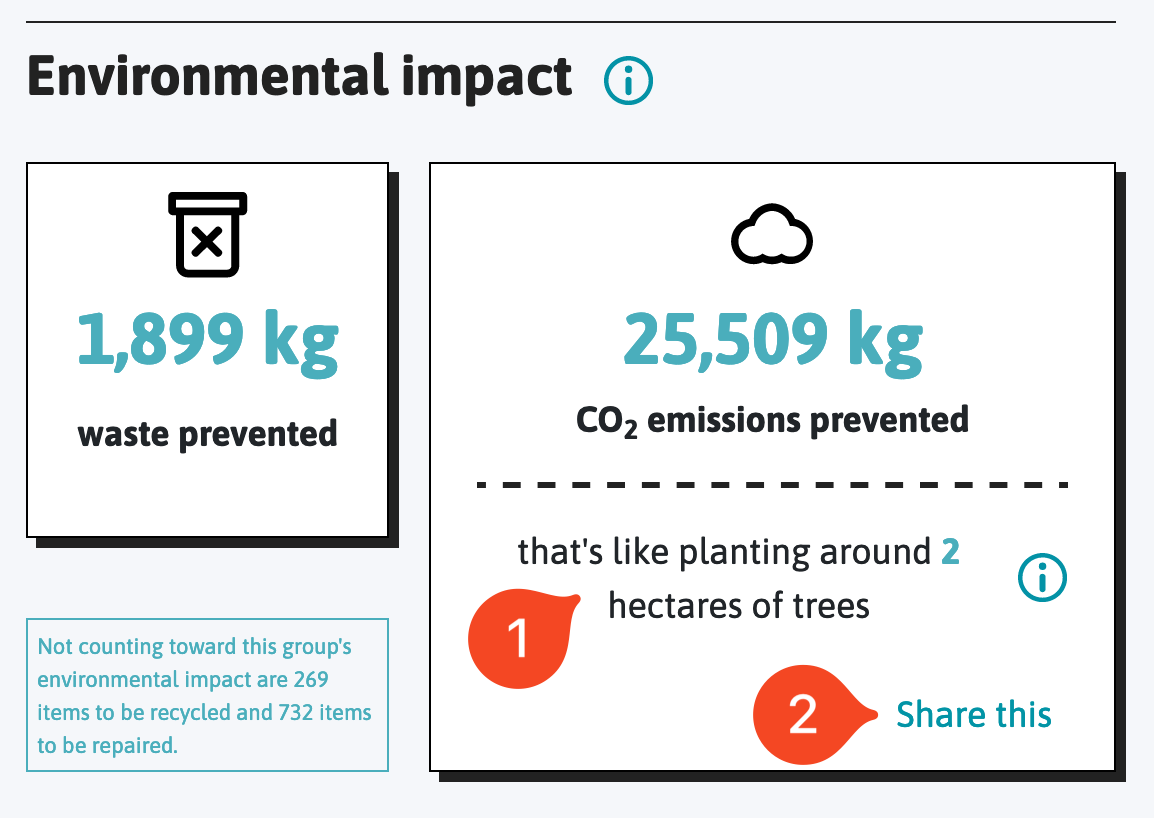
(Find this on any of your event pages or your group’s page).

2. New shareable infographics :deciduous_tree:

Number 2 in that screenshot is even more exciting!

We have introduced new visualisations using these positive comparisons that groups can download and share on social media to celebrate the emissions savings they’ve achieved.

By pressing ‘Share this’ below your CO2e stats for your event or group, the system will automatically generate an image for you visualising your impact.

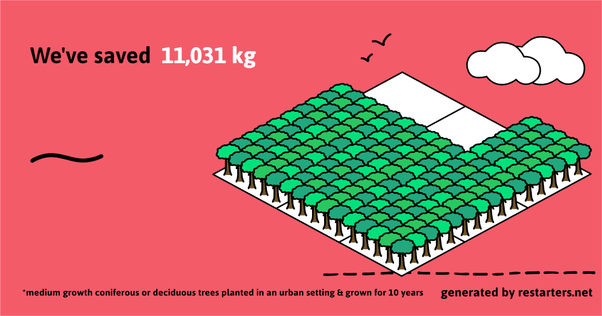
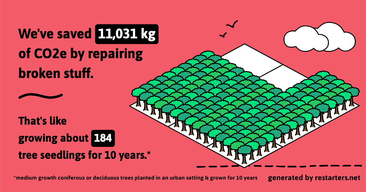
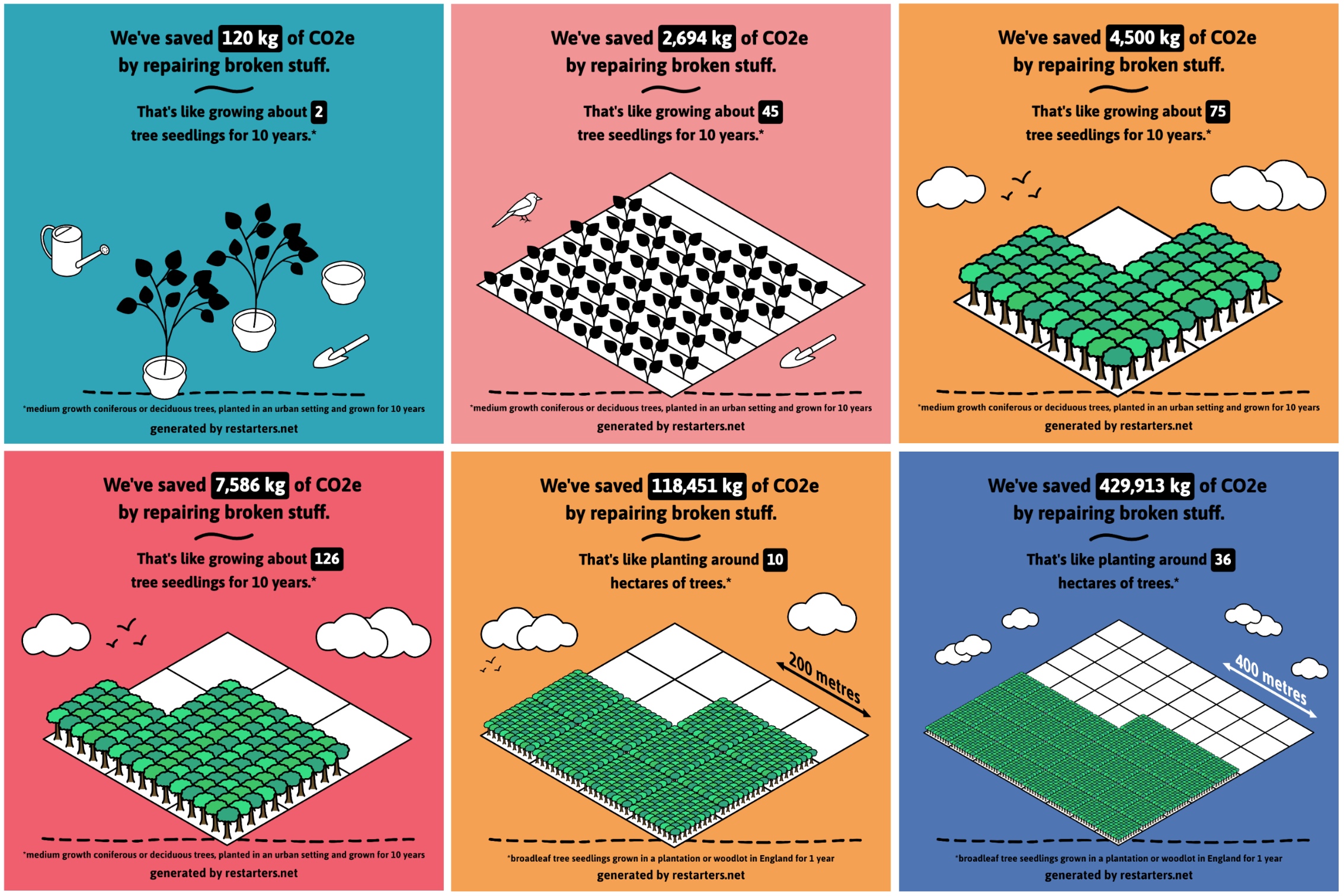
There are six different designs for different ranges of CO2e, with the number of trees reflecting the amount of CO2e saved.

Here’s what they all look like:

:translate: Ces images sont également disponibles en français !

You can also select which social media platform you’d like to share to: Instagram, Facebook, Twitter (or X) or LinkedIn. The image will resize depending on the platform you choose to make sure it’s optimised.

How does it work?

Here’s how to generate a shareable image for social media for your group or event:

  1. find your group’s page (which will be linked to here) or your event’s page & scroll down to the ‘Environmental impact’ section (usually about a third of the way down the page).
  2. click ‘Share this’ underneath the CO2 emissions prevented stat
  3. choose which social media platform you’d like to share the image on
  4. press the download button to save the image to your device

Sharable stats - how to

Then you’re ready to upload the image to a post on social media :slight_smile:

We’ve worked hard on these features and hope it can help you communicate the positive impact of the wonderful work you do!

If you have any questions about any of this, feel free to ask them below.

12 Likes

Hello James,
Thank you for your work !
Those infographics are really nice :slight_smile: it’s nice to share positive info like this :slight_smile:
For the future, do you think it is possible to have a system that caculates the impact on a given period ? If we want to share a recap of the year for example :slight_smile:
Have a nice day !

4 Likes

I have tried this feature out for the Repair Cafe Gosport lifetime statistics.

However, it looks like there may be a sentence missing that explains what the picture means. Should there be some text below the statement: We’ve saved 11,031 kg?

1 Like

Hi Keith, you’re absolutely right, there is some missing text there. Thanks for flagging this. We’re aware there may be a bug that affects older versions of some browsers and are looking into it.

Which device and browser are you using?

Here’s what it’s supposed to look like for Repair Cafe Gosport:


Great question Jon! This isn’t planned at the moment, but if you think it would be a useful addition, we can add it to our list of feature requests (though I can’t promise we’d get to it soon)

1 Like

I am running Chrome: 121.0.6167.86 (Official Build) (64-bit) on Windows 10. I have also tried Microsoft Edge Version 120.0.2210.144 (Official build) (64-bit), I get the same issue.

It does however work on Chrome on my iPad.

If you want any debug please let me know

Thanks Keith! We’ll make a note of those specs for our debugging and let you know :pray:

I think the positive message is good - we don’t want to be seen as nagging people about their carbon footprint, but at the same time I think we need both the carrot and the stick. And driving and flying are more relatable. Just how significant is planting a tree? Nobody knows, but everybody knows how many flights they take. Nor do we want to encourage complacency: “I’m alright - I planted a tree!”

Would it be more impactful to turn the statement round? 10 years is a long time. “You mean it’ll take 10 years for my contributionto have an effect??” Perhaps instead: That’s like the 10 year impact of growing n tree seedlings. (The end of a sentence it what hits you. Just a thought.)

Also, the first two infographics, could they just have green leaves??

1 Like

Tried it out on Mastodon the other day and it was quite popular, couple of dozen likes and boosts!

Naturally I have suggestions for the viz… time/resources permitting ofc:

  1. Download filename to include stats type, and date? “stats.png” is a bit anonymous and the group stats would overwrite event stats. For filing purposes and easy identification when posting, e.g. restart_group_20240124.png and restart_event_20240106.png (Could also include group number?)
  2. Render the date the image was generated? Or in the case of a single event, the event date? Could be small, at the bottom? (Optional?)
  3. Group name? Ofc some group names are long and unwieldy and probably hard to read when image resized on a mobile device. Can imagine this one being impossible to do well.

Any thoughts? :slightly_smiling_face:

That would be nice :slight_smile:

1 Like

Hi James

The infographic stats cards look great. Many thanks to you and the Restarters team for all your hard work getting this together. Looking forward to being able to share the stats card images for individual Repar cafe events on Facebook and Instagram. Any plans to have the stats cards available in other languages?

Cheers
Mike

Thanks for the feedback everyone, it’s great to hear your thoughts!

I’ll work through these one by one…

Glad you like the positive message. I think our aim was to use a metric that somehow felt like this work adds something extra, rather than compensates for other sources of emissions. I agree that we don’t want to encourage complacency. That’s actually one of our motivations for the change; we felt that ‘equivalent to driving x km’ can give the impression that it would now ok to drive that distance because the emissions have been somehow “offset”. Driving is more relatable for many, agreed. But is also a bit tricky, as it depends so much on the type of car (e.g. especially whether it’s electric or petrol etc.).

We discussed this in more detail here: How can we help you communicate your climate impact?

Thanks for this suggestion. The ‘10 years’ was intended to have the opposite effect! More of a “wow, instead of growing n trees for 10 years, those repairs took a few hours and had a similar impact.”

We can consider rephrasing that sentence, though we’d also need to consider how different wording would change the design and translations (and the implications for the code that generates it).
I’d be curious to hear others’ thoughts on this too!

Interesting! I really like the black leaves and think they look more stylish than the green trees (despite having designed the green trees myself :sweat_smile:)

I could potentially prepare a mock-up of how this would look, but we might struggle to find the time to change the designs on the platform. For a start, we’d need to prepare and export 120 discrete images (every possible permutation for those two designs). If we end up needing to make other changes, we could consider doing this.

This makes sense to me, but I have no idea how feasible that is. A question for @neil :slight_smile:

I can also see the value in doing these. Though it would involve changing all of the designs to accommodate the new elements. And your point about the complexity of adding the group name is a good one - I suspect it would be really tricky to accommodate all the edge cases.
With our current capacity, I suspect these would both be a bit beyond what we can do at the moment. So for now, we’d strongly recommend adding those bits of info to any social media posts that include the image.

The cards are currently available in English and French. We started with those because those are (by far) the most spoken languages for people who use Restarters. We could certainly consider adding new languages if there’s demand for it :slight_smile:

1 Like

Great work and lovely to have and share.
Just one question:

Will the homepage graphics on the restart project also be linked with this new look at some point? e.g. Repair Café Portsmouth - The Restart Project

Good question Clare. We’re not currently planning on doing this in the near future. In the longer-term, we are considering updating the sharable iFrames with the new designs, which we could then add to groups’ pages on our main website.

Is this a high priority for you?

Hi Keith,

We’ve released a fix for the bug you reported. It should now work as expected :crossed_fingers:
Let us know if it’s still a problem for you

To be honest, I think I’d probably just open the graphic that you’ve done for socials, copy and paste it to drop into our website or e-newsletters etc. I only spotted your website graphic was still the car, as I went there to look for something else. So not a priority on my part.

Ok, good to know. Thanks Clare!

Yes, I’d prefer something a bit more descriptive than just stats.png. Should be straightforward to do something dynamic. I’ll add in a follow-up for it. Thanks!

2 Likes

Sorry for the slow reply…

Personally I agree with @philip: the car/flying stats may be more relatable than tree planting especially to a wider audience.
You could avoid the “offset” connotation by saying something like “That’s equivalent to not driving an average car for X km” or “That’s the same as not manufacturing 2.5 sofas” :rofl:.

Could we not have a choice of equivalences and graphics so that groups could decide how to present them and allow them to display the stats in different ways?

1 Like

Hi @Dave - Thanks - I thought I was alone on this. I’d at least like to know the equivalences. I haven’t the slightest notion of how many trees you have to plant to offset a return transatlantic flight or how far you can drive for one tree. I can’t say the sofa equivalence was ever very meaningful to me.

1 Like

image

I’m liking the tree stat. I have no idea exactly how big a hectare is, but 129 of them filled with trees sounds pretty good.

But @Neil - lots of things can “sound pretty good” which aren’t!

I had no idea either, and never really got to know even how big an acre is. No doubt a farmer could look at a field and say “Yeah, that’ll be about 5 acres”, but not me.

So I’ve just looked it up. A hectare is 10,000m2, or 100m square. Near enough a square with sides 100yds. A bit easier. And 100 yds I believe is the distance between the III, II and I signs approaching a motorway exit.

Working backwards, it seems:
1 tree = 60kg CO2
1ha = 200 trees = 12000 kg CO2

1 tree = 300 miles driving
16.5 trees = 1 transatlantic flight.

A football pitch is 7140m2 so could grow 145 trees and offset 8700kg CO2 or offset 18 months driving at 30,000 miles/year.

(Anyone like to check my maths?)

1 Like