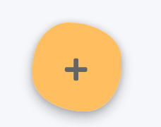
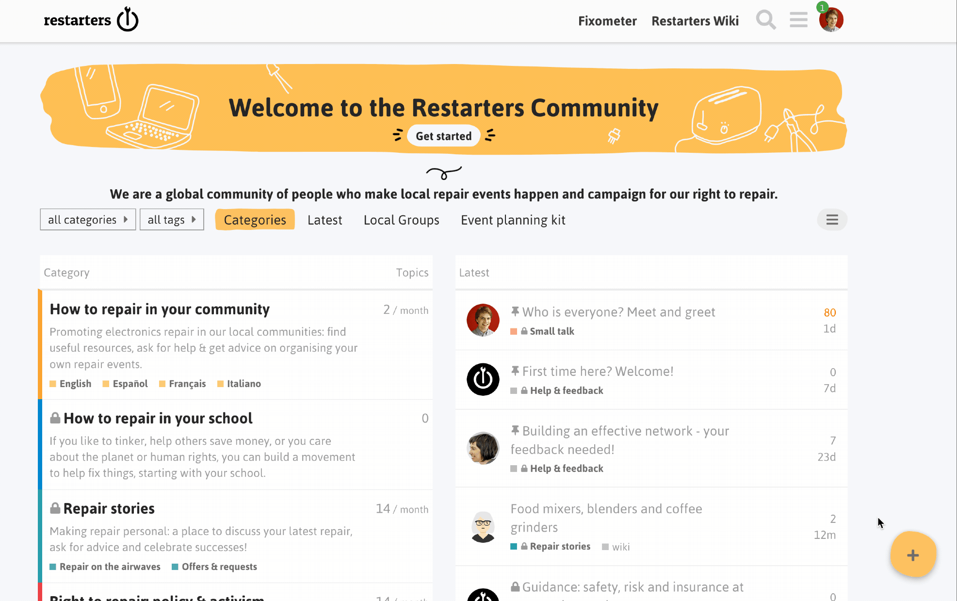
At the moment, the button to create a new discussion is a floating orange circle with a + symbol that appears at the bottom right of category pages and the home page. Like this:
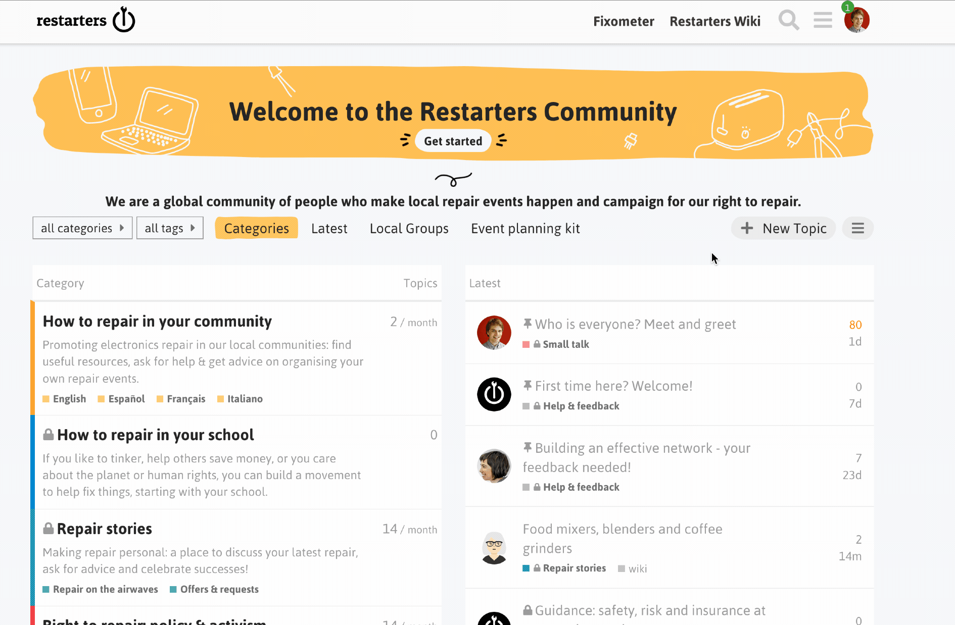
It changes to + New Topic when you hover over it, like this:
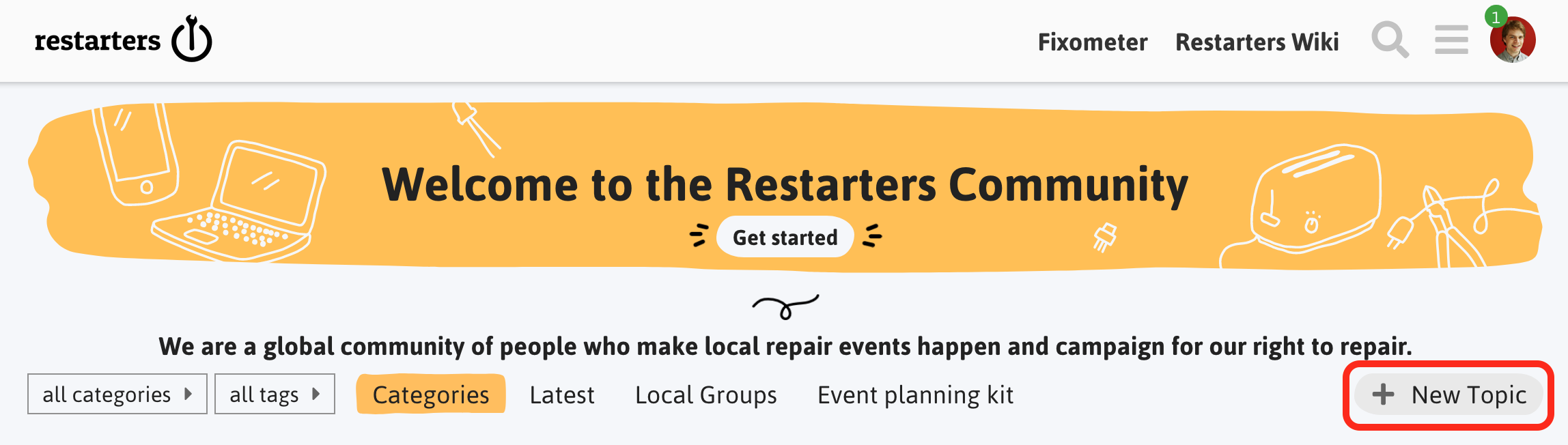
After some recent feedback about this being tricky to see, we’re wondering whether it be easier to change this to a button at the top of the page, near the navigation bar, more like this:
Great, yep, me too.
The mobile view already uses the second (new) option. So, actually, changing it on desktop would bring it inline with the mobile version
I also notice in the private messaging interface here, the new message button is up top. So I think this new option is more consistent. New topic and new message will be more similar.
Ok, one week later and there seems to be consensus! All 7 voters prefer the new suggested design for the ‘new topic’ button. I’ll make the change today
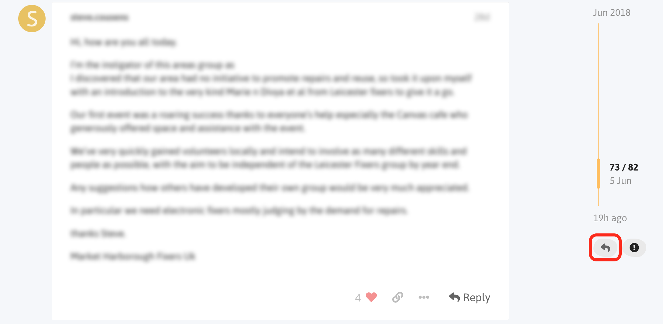
The Reply button highlighted in the screenshot above and the Reply button at the end of each discussion allow you to reply to the discussion as a whole. The ‘Reply’ button at the bottom of each post enables you to reply to that post specifically. Your reply will appear at the bottom of the discussion as normal, but it will be linked to the post you replied to.