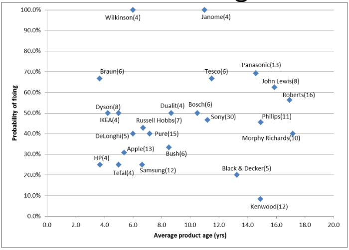
We’ve now been gathering technical statistics in the Cambridge Repair Cafe group for two years - nearly 1000 items in total. A summary of our findings to date is in the attached presentation. Repair Statistics V4.pdf (427.9 KB)
(One day, we may be able to upload this to the Fixometer!)
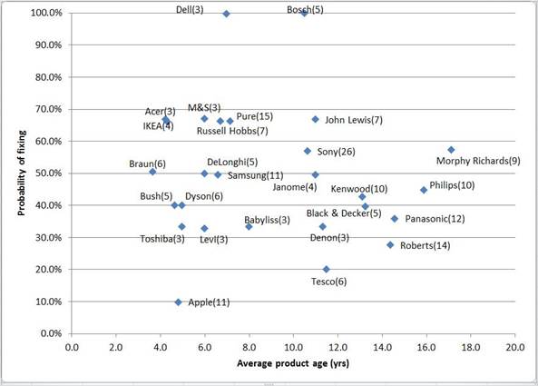
Thanks, Janet. There are some differences between that chart and the one in the PDF – as this is 2017, and the one in the PDF is 2017-2019. The differences
are themselves interesting and surprising (for example, the substantial improvement in repairability of Apple products – but that may be because we’re getting cleverer at repairs, rather than Apple getting more repairer-friendly!)
Would be great to see the data set evolve over time using animation, to see the datapoints as bubbles with sizes proportional to numbers of attempted fixes, a bit like Hans Rosling did with his “Gapminder”.
Google has a tool much like this, perhaps there is a non-Google version?
Thank you - that’s really wonderful – but do you have any idea how big his dataset is???
J
I must admit it’d be fun to play with – but there are other priorities at the moment – I’m off to Ghana in a few days. (I’m not sure whether we’ll be doing
a Repair Café there this visit.)
Obviously the Ghana dataset (much smaller) looks totally different! We’ve been unable to gather the age of items, as most were bought pre-used in the market.
The best we could do was “How long have you owned this?” – the average answer is six months.
Only just stumbled upon this thread and realised that I included a similar animated timeline in the ODD data viz a while back… here:
Its not responsive to window size, was difficult to select colours that overlapped OK so its a bit low-contrast, also seems to have developed a cut-off issue on the right-hand side. It relies on a static export of the data, so its not up-to-date or working in real time.
D3 is quite time-consuming and don’t have the time to improve it just now, if anyone else wants to, please feel free to nick the code, its all in the browser. (Data might not be though, can provide if wanted.)

 hope that’s ok